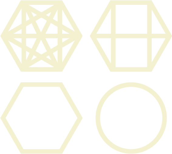
Law of Prägnanz
People will perceive and interpret ambiguous or complex images as the simplest form possible, because it is the interpretation that requires the least cognitive effort of us.
Read the original on lawsofux.com →
The scenario: a monthly KPI dashboard for a small coffee-roasting business. The numbers are identical in both versions — revenue, new customers, churn, and the same product-sales breakdown. Only the presentation changes: one version drowns the data in decoration, the other is already the simple shape your brain would reduce it to anyway.
✨ June Performance Command Center ✨
🔥 LIVE 📈 TRENDING ⭐ PRO- Espresso Blend — 32%
- Filter Roast — 24%
- Cold Brew Kit — 18%
- Gift Box — 12%
- Decaf Blend — 5%
- Ceramic Mugs — 3%
- Hand Grinder — 2.5%
- Subscription Add-on — 2%
- Stickers — 1.5%
June overview
Sales mix — top products
Five smaller products (Decaf Blend, Ceramic Mugs, Hand Grinder, Subscription Add-on, Stickers) make up the remaining 14% · View full breakdown
🔍 What changed
- The data is identical — same three KPIs, same deltas, same product percentages; only the presentation was simplified.
- Three typefaces, gradients, ornate borders and badges were replaced by three plain, uniform stat tiles.
- The tilted “3D” pie of nine slices became four horizontal bars — lengths are comparable at a glance, and the 14% long tail is summarised honestly in one line.
- Whitespace replaced decoration, so the numbers themselves are the loudest thing on the screen.
💼 Explaining it to stakeholders
“The brain simplifies whatever it sees — that's not optional. If we ship the decorated version, users do the simplification themselves and lose accuracy in the process: a 3D pie literally distorts the proportions it exists to show. Designing the simple version ourselves means the takeaway people leave with is the takeaway the data supports — and it's cheaper to build and maintain, too.”
Got it? Tick it off — your progress is saved in this browser and shown on the index.