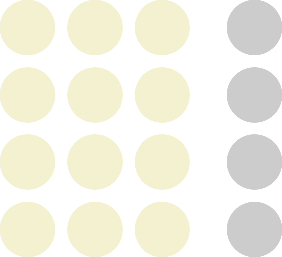
Law of Proximity
Objects that are near, or proximate to each other, tend to be perceived as a group.
Read the original on lawsofux.com →
The scenario: a shipping-details form. The fields and labels are identical in both versions — only the spacing changes. Notice how in the first version you genuinely can't tell which label belongs to which field.
What's wrong here?
Every label sits exactly halfway between two fields, so the eye can't tell if “Postal code” names the field
above it or below it. The checkbox floats away from its own text. Users fill in the wrong boxes,
then get validation errors they don't understand.
Shipping details
What changed?
Nothing was added or removed. Each label now sits tight against its own field, with clear space
separating each label–field pair from the next. Grouping is instant and effortless — no one has to think.
Shipping details
🔍 What changed
- Labels moved close to their own fields; whitespace between pairs is larger than within them.
- The checkbox and its text now touch, so they read as one control.
- Zero new components, zero new copy — spacing alone did all the work.
💼 Explaining it to stakeholders
“People perceive things that are close together as belonging together — before they read a single word. Getting spacing right costs nothing and reduces form errors and support tickets. Whitespace isn't wasted space; it's doing the grouping work so users don't have to.”
Got it? Tick it off — your progress is saved in this browser and shown on the index.